Grayson Perry - The Pre Therapy Years

During this world wide pandemic museums and galleries have closed their doors and art feels suspended, silently waiting to be viewed again. Grayson Perry’s latest exhibition is no exception. The Pre Therapy Years opened on the 24th of January at the Holbourne Museum in Bath and was supposed to run until the end of May but due to Covid-19 the exhibition was only open for a few weeks. Just before lockdown I was lucky enough to view this extraordinary exhibit. I have been a huge fan of Perry’s art since he won the Turner Prize in 2003 which rocketed his career as one of Britains greatest contemporary ceramicists.

This new exhibition is a huge retrospective of Perry’s early creative works from the years 1982-94. Put together with the help of modern technology, which included the use of Twitter, asking if the general public had purchased any pieces from the Artist in those early days and could they be brought back together for this exhibition. A brave move by Grayson, as an artist I’m not sure I really want to encounter some of my earliest works again!

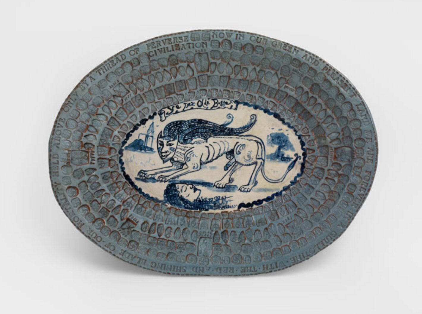
The Pre Therapy Years shows the journey of a younger Grayson Perry, who we now have come to think of as a national treasure but who has never strayed away from narrating human stories within his works. Exploring themes such as identity, gender and social class with an explicit wit and charm we know and love. Some of my favourite works include ‘Now in Our Green and Pleasant Land (Ye Dear Olde Bugger)’ 1985. A beautifully bizarre earthenware blue glazed platter with a disembodied head and mythical creature illustrated in the centre, surrounded by hundreds on tiny indentations of Perrys signature stamps.

I also loved a collection of dark blue urns, featuring glazed cut outs using a stencil technique and beautiful sculpted reliefs of angels, skulls and biblical figures. One urn reads; ‘A trophy for the victor, who did not compete in the good spirit of sportsmanship but for honest monetary gain.’

Adjustments.jpeg
Adjustments.jpeg

The Holbourne Museum in Bath is currently closed but the exhibition has been extended till January 3rd 2021 in hope that galleries will be able to open their doors again soon. Although the museum entry is free, entry to the exhibition is not and tickets will cost you £12 per person. There is also a wonderful book to accompany Grayson’s newest show of the same name for a more in-depth look into the start of his career.

Melvin Edwards – ‘Sekuru Knows’

download.jpg

Melvin Edwards – ‘Sekuru Knows’ from the Lynch Fragment series 1988. Steel Sculpture.

I chose this artwork for discussion simply because it intrigued me and made me want to ask questions. Was it a representation of identity or was it just object art? I had previously never encountered Edwards work before and I wanted to know more. This small, wall mounted sculpture appears to be crafted from found items. There are large scissors or shears dominating the foreground of the piece, sharp blades weaved between a thick chain and a shackle. The metal appears black, completely void of colour.  I feel a lot when I look at this piece of Modern Art. I feel cold from the steel itself but also from the subject matter and its representation of slavery. The horror within history of people being kept in chains.  I also feel heat from this work. The heat of the metal being forged together, fire, sweat, hard work not only from the artist but the heat of the hard labour felt by slaves across America. Keeping the sculpture one colour allows all the objects within it to become one entity. I read that each sculpture in this series is roughly the size of a human head allowing it to confront the viewer. The pieces almost become mask like in their form. I had to look up the word ‘Sekuru’ which comes from Zimbabwe and can either mean, Grandfather/Uncle/Cousin or Respected Elder. Now this sculpture has an identity and is no longer just an object in Modern Art.

Art & Society

Across history artists have documented culture. Powerfully, through image, either informing or questioning events caught in a moment in time. Some images have even led to a change, an awareness and a call to action.

Kerry James Marshall’s incredible paintings focus on the Civil Rights Movement and the everyday lives of African Americans. His painting ‘Untitled – Policeman’ was created in 2015, at the beginning of the Black Lives Matter movement in the United States. In the artwork there is a policeman perched on the front of his squad car. This painting speaks volumes about identity. It not only critiques the racial profiling by law enforcement but acts as a reminder that many black people serve within the police force. ‘The duality of being black and serving in blue.’ Marshall’s works are just so amazing, the harmonious tones of colour indicting a setting of night and his wonderful vivid style. I love the little details like the lamps in the background and their spiky glow in the evening sky.

cri_000000340652.jpg

Shahzia Sikander studied the techniques of Persian and Mughal miniature painting. This traditional art form was used to tell stories of religious and historical context. Sikander took this practice, which creates overlapping layers of washes of inks and paint, to express ever changing forms and identities. She plays with context, multiple meanings and symbols, playfully with no fixed narrative. She uses silhouettes of men, women and beasts forming together. In the work ‘Candied’ the black lines represent Gopi the lover of Krishna. I was really drawn to Sikander’s works, they are so sensitively made and they feel almost dream like. I love the white figure at the top of the piece, she either looks like a woman dancing or a playful spirit. It reminds me of a story like A Midsummer’s Nights Dream. The characters are almost moving with each other in space and time.

31370.jpg

Felix Gonzalez-Torres uses a recognisable object to depict a disease effecting many lives in the late 80’s early 90’s. The AIDS crisis. The work ‘Untitled – Perfect Lovers’ was created shortly after Gonzalez- Tores’s partner was diagnosed with HIV. The two identical clocks are initially set to the exact same time, touching each other on the wall. Eventually, the clocks will fall out of sync or completely stop. The simplicity of this artwork is its power. The clocks represent the presence of two people, although starting at the same time no two timelines are the same. Declining health can slow one down or even stop its movement entirely. The clock as an object records time for us every day. They are on the walls of our homes or workplace, worn on our bodies and a constant reminder on our phones. This artwork marks the inevitability of its flow, time is precious and nobody knows how much they have left. “Time is something that scares me… or used to. This piece I made with the two clocks was the scariest thing I have ever done. I wanted to face it. I wanted those two clocks right in front of me, ticking.” This artwork for me was one of the most powerful under the theme of society. Although it talks of the AIDS crisis its message is a universal one. We all love and care about somebody in our lives and the idea of being without them is too much to consider but we are all a ticking clock and we all have our own timelines to follow.

cri_000000210576.jpg

Transforming Everyday Objects.

On a personal level ‘Object Art’ has been one of the most difficult art genres for me to engage with.  There have been many experiences for me where I have walked into a grand museum or gallery and seen an object like a single shoe in an empty white room. I just didn’t get it. I refused to give it time and I’m sure this single shoe was a terrible example of ‘Object Art’ but it had a profound effect that this type of art just wasn’t form me. It’s going to take some convincing.  

Marcel Duchamp was the pioneer of this ‘Object Art’ and the movement of Dada. Formed in the First World War this artist genre tried to create satire in this time of uncertainty and horror. It broke all the rules and challenged what at the time was considered art. In 1913 Duchamp created ‘Bicycle Wheel’ a kinetic sculpture of an upside-down bicycle wheel drilled into a wooden stool. This was to be the first of his ‘Readymades’, Duchamp elevated everyday items to challenge the idea of taste. For me I started off disliking this piece, it looked crude maybe it even made me feel uncomfortable to start with but that is its power as an important piece of art. It challenged me, to think differently and I can see now that at the time it was so radical that it challenged the entire art world.

cri_000000063009.jpg

In 1936, whilst enjoying tea with Picasso, Meret Oppenheim had an idea that would lead her to create one of the most important surrealist objects of all time. Titled simply as ‘Object’ this delicate teacup, saucer and spoon are wrapped in the fur of a Chinese Gazelle.  An idea that an everyday object that everyone is familiar with, can undergo a transformation to become art. It is still very much a teacup, by structure and form, but it questions how we might now interact with this object. In a very male dominate genre this propelled Oppenheim to greatness which paved the way for more female artists. I love this piece of object art, it plays with humour, it feels a little sinister maybe even a little erotic in its gesture to female form. Surrealism was used to challenge and bewilder sensation and this piece certainly does that. I imagine myself using this everyday object, holding the warm fur tea cup would almost emulate a small creature alive in your hand.  Visualising, licking the sugar of the spoon makes me feel so uncomfortable, the sensation of the fur in your mouth is almost grotesque. A brilliant piece of art that plays with the senses.

Meret-Oppenheim.-Object-469x311.jpg

‘Sky Cathedral’ created by Louise Nevelson really excited me. Its large, domineering presence within the clean white space feels like a giant void, or a gateway to another world. Nevelson’s family were in the timber trade and I feel like this was why she was drawn to the use of wood within her sculpture. Created in 1958, ‘Sky Cathedral’ is formed of over 60 wooden boxes, containing found wood from spindles, furniture and scraps and then solidified by the colour black.  

“When I fell in love with black, it contained all colour. It wasn’t a negation of colour. It was an acceptance. Because black encompasses all colours. Black is the most aristocratic colour of all. … You can be quiet and it contains the whole thing.”

With its cubist composition, the shrine draws me in to really look at its objects that make up its form. I almost want to know what past life these objects hold now in their new arrangement. They have been born again.

136_1958_1-57_CCCR-296x395.jpg

‘Object Art’ has really confronted and challenged my feelings towards this type of art, which is exactly its intention. I’ve been to quick to dismiss this genre in the past as lazy or pretentious but taking a closer look at these well-known examples I have enjoyed the challenge. If an object can evoke a feeling, either of connection or even make us uncomfortable then the artist has created art.

Identity in Art

Identity in modern art is a broad and exciting theme, allowing the viewer to gain new perspectives and understanding of other people’s lives. For the artists that draw inspiration from their identity, the work becomes a podium for exploration, expression and connection

Frida Kahlo is one of my favourite artists. I first was introduced to her paintings around 20 years ago when I was recovering from a serious RTA. My injuries were extensive, including a broken spine and I found her courage and tenacity (for creating work whilst bedridden) very inspiring for me to start committing to an artistic practice of my own. Our identities are very different, (different points in history and different geographic locations) but the emotion in the work connected me to Kahlo. The work talked to me on a powerful level.

Her painting ‘Self Portrait with Cropped Hair’ 1940 shows a defiant Kahlo. She created this work just after her divorce from Diego Rivera. She paints herself sitting in a chair, wearing an oversized large jacket, just like the one her artist husband was famed for wearing. Her hair lies in tresses, cut off, around her feet. There is a verse of an old Mexican folk song painted at the top of the self-portrait. ‘See, if I loved you, it was for your hair, now you are bald, I don’t love you anymore.’ In this artwork Frida is playing with her identity. She is portraying herself as strong and masculine, detaching herself from her feminine traits such as her hair that almost binds her to her husband through love. She’s reclaiming herself and her space after her divorce. She is no longer the wife of an artist; she is The Artist.

Kahlo-Self-Portrait-with-Cropped-Hair-276x395.jpg

Henri Matisse was a very prolific artist and during his life he found both critical and financial success. ‘Red Studio’ celebrates these achievements and solidifies Matisse’s identity as an artist. Known for his bold approach to colour, this studio portrait abstracts the room to drawn the viewer into the art on display. Matisse’s achievements. All the furniture in the room, (chair, table, plinths) are represented just by simple line. They have a function within the space but they are not the focus. All of the artwork and sculpture in this piece is depicted bright and bold, a true representation of a famous Matisse works. There is an exhibition going on within this one painting. In the centre line of this painting, stands a grandfather clock. Simple line work, no numbers, no hands. Could this represent the artist himself in this sacred place? Where time stops and all that matters is the art.

cri_000000151523.jpg

Glenn Ligon’s artwork was new to me but I found his exploration of identity really interesting. ‘Runaways’ is a ten lithography print series based on eighteenth century advertisements that were published to find slaves that had run away. Ligon asked friends to describe a photograph of him as if he was missing person. What visual markers from a photograph make up our identity to others. Race? Gender? He was surprised that the descriptions his friends had made from his photo were very similar to the original texts from the slave advertisements. He went on to use this text along with images and styling from the original ads to create his own artwork. Ligon states that his work shows how an individual’s identity is inseparable from the culture and the way people see you. I have found looking at the work very powerful. It questions the assumption’s society makes about identity because of how you look, which can lead to stereotyping and racial prejudices.


urn-3_HUAM_INV196627_dynmc.jpg

Identity is such an important subject in Modern Art. It can be used to celebrate an identity or it can be used as a platform to express and teach others what life can be like from another perspective. I find it fascinating that from really looking at a piece art, a picture, we can learn so much about another person’s life.

Places and Spaces

As someone who, in one form or another, has enjoyed art from a young age, I really thought I had solidified my artistic taste. But during this pandemic I’ve taken the opportunity to look closer at works of art (virtually). While galleries and museums remain closed until further notice, they are allowing you to explore collections online. This week I took a look at pieces of art from the MOMA’s collection in New York around the theme of Places and Spaces. This has really challenged my perspective and opened me up to different artists and styles of work, that maybe I wasn’t open to before.

1200px-Van_Gogh_-_Starry_Night_-_Google_Art_Project.jpg

Like most school kids in art class I studied Van Gogh. Emulating sunflowers and swirling starry skies in the classroom, I hadn’t give Vincent much time since then, until I visited the Moma in New York a few years ago. When I walked in to that gallery I was breathless and emotional. Drawn to this canvas, (smaller than I expected), I was shocked that I began to cry. This image wasn’t new to me, I had seen it reproduced countless times before in books, on magnets, mugs and t shirts but up close the emotion in each brushstroke left me breathless.  That memory and encounter with such a work will stay with me forever and I have had a passion for Vincent Van Gogh ever since. I was pleased to see ‘The Starry Night’ as one of the first pieces of art within ‘Places and Spaces’. Knowing that Van Gogh made this painting from the asylum in Saint-Remy-de-Provence, you can feel the artist’s turbulence within the sky and as the viewer you can relate to the deterioration of his mental health. I think you can feel his loneliness too, I feel overwhelmed and consumed by the sky. With details such as the roof of the church not being authentic for this landscape but reminiscent of his homeland in the Netherlands, I feel this represents the struggle he felt being committed. I think he was looking back and referencing a happier and safer time in his life.

cri_000000468416.jpg

‘House By the Railroad’ was a painting that took me by surprise. I was aware of Hoppers work, mainly because of well known works such as ‘Nighthawks’. I think if I was visiting a huge museum for the day, it’s the kind of painting that I just wouldn’t have the time to give it and I’m sad to say that I would have probably dismissed it. However, not anymore. Edward Hopper gives the building status, in this almost portraiture approach. ‘House By the Railroad’ on first look seems just like an accurate interpretation of a building, easily disregarded,  but on closer inspection there is a real story within the picture. Firstly, the light is incredible, (one of the things that Hopper does best) but there is a darkness there, a sadness. A grand Victorian home, that probably once belonged to a wealthy family, someone of importance and grandeur once resided inside. But now, there is a loneliness, the work is devoid of all figures and the house stands deserted. Only the single track of the railroad breaks your view in the foreground of this painting bringing in the narrative of movement and progress within the American landscape.

cri_000000311910.jpg

Documenting this progress with his ‘Anarchitecture’ Gordon Matta-Clark’s ‘Bingo’ was another artwork that got my attention. Dismantling the side of a derelict house located in Niagara Falls into 9 equal sized rectangles (like a bingo board) and carefully curating 3 within the clean, white space of the gallery allows the construction of an ‘object’ to be viewed as a series of graphic lines and shapes. I love the perspective of being able to view both sides of this home almost simultaneously and my favourite part is the view of the internal structure, like the stairs because these are shapes that can be only visible through the process of deconstruction.

cri_000000233290.jpg

The simplicity of breaking down everyday objects into shapes is beautifully observed in the print series by Zarina ‘Home is a Foreign Place’. This poetic piece consists of 36 woodblock prints, using geometric shapes depicting migration, exile and the meaning of home. I love how the artist represents different elements of home life with simple lines and shapes. They are very powerful and reference the subject of ‘home’ which we can all relate to.  One of my favourite woodblocks is the ceiling fan. Defined simply by a pair of crisscross lines, it’s the placement at the top of the paper that I love, representing the fan within the room and as the viewer I feel like I’m stood underneath it looking up.

Challenging myself to look at different styles and types of Modern Art has opened me up to new ideas and artists I previously hadn’t encountered. I’m looking forward to my next visit to a gallery or museum so I can view more works of ‘places and spaces’ and expand on my knowledge and perspective.

Reflecting During The Pandemic

Park Life - Bristol. UK

Parklife.jpg

Like most of the world right now, here in the UK we are in lock down. We are permitted to leave our homes 1 hour of the day for exercise or to fetch food and medicine. I use my hour at 6am every morning for a quiet walk around my neighbourhood. I end my walk on top of a hill in my local park near my house. Here is the view, badly taken on my camera phone in the rain. Its not a pretty picture or even a memorable cityscape but here are the reasons I wanted to write about it on my blog.

From the left side of the skyline following in to the centre of the image the first point on the horizon (which is just a little line). This is a giant spire of a Catholic Church based in the borough of Clifton. This is where I used to live when I was studying at University in a shared student house. I remember the friendships I made, meeting my husband for the first time, the late nights and the deadlines. The next 'point' along the skyline (surrounded by trees) is Cabot Tower, a view point in another of the city's parks. I remember the lunch breaks from crappy jobs in that park, dreaming big and making plans to become artists and exhibit our works.  The wider, squarer-er tower, just passed centre, is Bristol University. I would walk across the city to the art supply shop nearby to purchase my materials. Excited to try something new or add a different colour into my practice that week. The crane, drawn down to the mid ground is right by my local swimming pool. I would usually swim four times a week. After, the smell of chlorine would linger as I headed to my favourite coffee shop, where they knew my name and asked about my day. Strangers becoming friends. Lastly, back to the horizon, there is a thin structure that looks like a match. That's St Michael's Maternity Hospital. Today my friend is bravely in the hospital having her baby during this global pandemic. I don't know when I will get to see her again. All these things that were an integral to my daily life are now very far away. As I stand on this hill, reflecting, I feel like a spectator and disconnected. Many of the things that this place holds I took for granted, but when this is over, I will have a greater appreciation for the people and places within this city.  

Sarah Ball - Themself

‘He allowed himself to be swayed by his conviction that human beings are not born once and for all on the day their mothers give birth to them, but that life obliges them over and over again to give birth to themselves.’ - Gabriel Garcia Marquez (Love in the Time of Cholera)

public.jpeg

Themself is a stunning collection of haunting portraiture by British artist Sarah Ball.

Born in 1965 in Yorkshire, Sarah now lives and works in west Cornwall. Her artistic practice is inspired by found source material, from newspapers to historical photographs and even mug shots of individuals and most recently selfies from social media. Her work has been exhibited internationally including The Royal Academy, Somerset House and The V&A.

Ball’s most recent solo show is currently on at Anima Mundi in the Cornish town of St Ives.

St Ives is famed for its connection to the creative arts, especially painting and although there are countless galleries and shops representing seascapes and more traditional Cornish art, for me it was very refreshing to come across a contemporary space like Anima Mundi. Sarah Ball’s fantastic works drew me in from across the street, the haunted eyes and expressions of her subjects made me want to know more. Painted in oil on either canvas or board, her technique is flawlessly smooth with muted backdrops to draw you into the subject. Ball’s muses for this sell out exhibition were from a selection of vintage photographs and here are some of my favourites.

‘Tim’, ‘Elise’ and ‘Izzy’

public.jpeg
public.jpeg

This incredible show is on now and runs until 6th September at Anima Mundi, Street an Pol, St Ives. TR26 2DS.

Or you can check out the exhibition online at sarah-ball.co.uk

Yorkshire Sculpture Park - Damien Hirst.

My little sister got married at the end of last month and as she now resides in the fantastic city of York, it was a great excuse to revisit the YSL again. Me and Mr C had previously visited the sculpture park a few years ago for the Kaws exhibition, which was brilliant. Not only was the work by Kaws fantastic, the grounds were stunning, we discovered world renowned artists work around every corner which was so exciting, and you certainly clock up the kilometres walking around all day. For this visit, the featured sculpture show was by none other than Damien Hirst who as a Young British Artist in the 1990s has dominated the art world ever since.

public.jpeg

Hirst has 4 large bronzes on the YSL site and 3 within the Leeds city centre. The 4 sculptures we visited were all in the newly revived 18th Century deer park and they looked like they were made for that setting. ‘Myth’ (pictured) was one of my favourites. The vibrant anatomy against the marble white of the mythical unicorn felt very clinical but also powerful, giving a nod to the traditional art history of horse bronzes. ‘Charity’ was a stunning feature to the exhibit, although I have previously seen her in recent years at the RWA in Bristol, she is still a delight with her teddy bear and her ‘Please Give Generously’ sign.

public.jpeg

‘The Virgin Mother’ stood impressively by the estates lake. Referencing the stance of Degas’s ‘Little Dancer’ her medical atonomy, shows her exposed foetus, muscles, skull and breast tissue. Hirst loves to play with contemporary, medical references and religious iconography to tell a story. She has a similar feel to ‘Verity’ which stands proudly at over 20 meters tall, looking out to sea in Ilfracombe harbour, Devon.

public.jpeg

The biggest surprise for me was ‘The Hat Makes The Man’. I would never have thought it was a Damien Hirst sculpture. I am very familiar with his animal, religious and anatomical works but this threw me….. but I loved it! Created in 2004-07 this piece was based on a 1920s collage by Surrealist artist Max Ernst which consisted of cut out images of gentleman’s hats absurdly stacked. It is thought that Ernst was inspired by Sigmund Freud and his his theory that a hat is a symbol of repressed male desire. Hirst plays with this idea in three dimensions, stacking the hats high making phallic- objects. Created in bronze but beautifully painted to imitate the original object (wood, plastic and textiles) it was hard to believe it wasn’t a found object piece. I love how Hirst plays with the grandeur associated with bronze casting by painting it to look like plastic or a disposable material.

If you want to check out this show you have until 29th September but I highly recommend a visit to the Yorkshire Sculpture Park at anytime of the year because their permanent collection is incredible.

Cash Is King 2

public.jpeg

This week was the opening of an amazing exhibition ‘Cash Is King 2’ at Saatchi Gallery in London. This show was a second instalment of art on banknotes with artists free to use the cash in whatever form of expression they liked. There was a lot of defacing and a big f**K you to consumerism and of course the Tory government and brexit was a key feature. There was also some beautifully meaningful pieces by the artist Aida Wilde who along with the support of Choose Love, the refugee charity, created poignant and thought provoking pieces including Syrian currency carefully folded into delicate boats to highlight the refugee crisis.

public.jpeg

My husband, artist CopyRight was another of the artists involved in this project (and I am really proud) He had a series of 6 American dollars available at the exhibition, featuring a single Monarch butterfly. This was a representation of capitalist culture combined with the idea of a British Monarch which features on our own currency here in the UK. Could this also be a representation of the relationship we might have with the US after Brexit?

public.jpeg

The opening night was brilliant, such a great atmosphere and the attendance of artists and art lovers was impressive - a credit to Carrie Reichardt, Bob Osborne and Olly Walker who put the show together. I highly recommend checking out this exhibition, the work was amazing and affordable from a very high calibre of artists. The show runs until the 8th September and there is also a great book to buy from the show featuring the work from this exhibition and the previous ‘Cash is King’. Highly Recommended!

Plastic Free July

This year in our household we have made some major changes to live more sustainably and to reduce our plastic consumption. It made sense to pick up a copy of Martin Doreys ‘No More Plastic.

IMG_20190703_074727_449.jpg

The changes in this book are simple and if we all make a couple of simple swaps it can amount to a big change. Most of the changes in this book we are giving a go but like I've said before, some changes from single use plastic can be more expensive.
With my art I am always pushing forward my passion for nature and this planet so I felt like it would be hypocritical if I did nothing to change. I am so frustrated with our world leaders not doing enough to tackle climate change but I realise I have the power to vote with my wallet and give my money to businesses who are trying to make a difference. Once you start to notice plastic it becomes mind blowing that it is everywhere! I was shocked by finding out it's in most tea bags!!! I love tea, so that has now been changed thanks to @pukkaherbs💚

What changes will you make?

martindorey #nomoreplastic

BOOK CLUB - Maggie O’Farrell ‘I am, I am, I am.’

I have always loved books, but over the years fell out of love with reading until a couple of years ago. Since then, I have made time to reignite my passion for a good book and I have decided to share my latest reads here on my blog. I’m not the fastest reader but I’m averaging about one a month. I love crime and horror fiction as well as anything nature, self help and obviously....art. 

First up, a memoir of sorts by Maggie O’Farrell  - ‘I am, I am, I am, Seventeen Brushes with Death’ 

Bookmark by Ark Colour Design. 

Bookmark by Ark Colour Design. 

I have read other titles, years ago, by O’Farrell such as the brilliant ‘After You’ve Gone’ which was heartbreakingly good, so I knew her writing was great. I picked this up as a travelling companion with another couple of books for my trip to Chicago but I didn’t get a chance to start this one. I’m not the best flyer and combined with a dose of Valium, I tend to zonk out in front of a kids movie instead. I’m kinda glad I read this memoir with my two feet firmly on the ground, as an early chapter entitled ‘Full Body’ would have set off my anxiety at 30,000 feet.

As soon as I read the subtitle of this book I knew I had to read it. Having brushes with death myself I am always curious at other people’s experiences. Seventeen chapters, beautifully descriptive, intoxicatingly dark mixed with heartbreak but always a silver lining of hope and joy. O’Farrell really lays everything bare from dangers at sea, strangers, birth and miscarriage. I think every reader will connect with the chapters, and by the end, the book leaves you with an understanding that life is precious and fragile but also really f**king hard for every one of us in one way or another - which should make us embrace the ones we love and the good times just a little bit more tighter.

A few years ago a good friend of mine over a glass of wine (or two!) joked that I was like a cat with nine lives. As well as my accident (which I am always banging on about)  I have been hospitalised more times than I care to remember. As well as my RTA, which changed my life, I have been hit by a car, multiple asthma attacks, glandular fever (which caused my air way to swell closed), a breast cancer scare and complications during miscarriage. We all have moments similar to these in our lives, similar to O’Farrell, we also have those everyday smaller moments when we reflect on our mortality. The change in the air pressure, that moment a speeding lorry passes by a little too close to the pavement. Or that bit of food, that goes down the wrong way or wedges for that split second in your throat. ‘That was a close one’ we think and then get on with our day.

I highly recommend this read, it’s live affirming, death defying and a celebration of life. It has left me with a feeling that we all need to be more compassionate for one another as you never know exactly what another person could be dealing with in their life. We are living in a toxic society of judgement, where people seem to have no filter when it comes to opinions about others. It can be hard to empathise when you feel like your at sea but know this, we are all in that same boat in one way or another, especially when it comes to death. It’s our only certainty in life.

In paperback this book retails for £8.99 but I have seen it for as little as £2.00 on kindle. Give it ago and tell me what you think or give me recommendations of great books you’ve read too. 

Small Steps.....

I don’t know about you but I get frustrated a lot about time and the lack of it. ‘How is it June already?’ I sighed yesterday. ‘Nearly half the year has gone and I haven’t done half the things I had planned.’ I know this is a feeling for nearly everyone out there and especially if you run your own small business or hustling hard doing your own thing.

Starting out on your own is tricky and it is something that no one (especially in our education system) teaches you how to do. Firstly you have to be the wearer of many hats. Most important, ‘Maker’ (of course, your passion, your ‘art’), social media expert (distracting you from the making), accountant (too many numbers), head of distribution (visiting the local post office 5 times a week), office manager (where is that pencil), head of HR (which is just organising yourself), mental heath consultant ( I can’t do it today)…… you get the picture. Not to mention this year I wanted to add ‘blogger’ and that ‘hat’ has been gathering dust for the last couple of months. * sigh * ‘Small Steps’ If your lucky, you can employ/bribe/exploit an intern to take on some of these roles but for me, well….. it’s just me and like most, that’s a lot to manage in very little time.

I constantly feel like I’m not working hard enough, I’m not good enough, not doing things right. It’s just me on my own (I have an artist husband but he has his own shit to deal with). I don’t get holidays, performance reviews or pay rises. My mum sometimes calls and says she likes something I posted on Facebook but I’m not sure that’s a great measure of the contemporary art world - sorry Mum, love you.

But I wouldn’t change it.

Now, at the start of the summer I’m making plans of things I want to try and achieve, the things I want to say and the artist I want to be for the rest of the year. When your working so hard in the present and focusing on the future, you forget about the small steps that you have already taken and how far you have come. And not all those steps have been forward. I’ve made a lot of mistakes, weeks of work that have become failures, galleries closing, lost artwork, companies ripping me off. I’ve been backwards, forwards, side stepping, running, laughing and crying over the 10 years I’ve been making art and fellow creatives I know and love, feel the same and are on that same journey too.

So don’t linger in the past, but take a little look back and see how far you’ve come. Imagine what can be achieved in the next couple of years… what will all those small future steps add up too? For anyone who is hustling today, making it on their own and wearing multiple hats - I see you and ‘Good F**king Job’

Progression over 9 years.

Progression over 9 years.

Art Institute - Chicago

Located in Downtown Chicago not far from Lake Michigan is the Art Institute, one of the largest collections of art in America. Protected out front by two large cast bronze Lions who have become unofficial guardians of the city. The pair were unveiled on May 10th 1894 and were sculpted by Edward Kemeys who was a self taught artist but went on to become one of the countries greatest animalier (sculptor of animals). The lion positioned north of the steps is titled “on the prowl” and the other to the south “in an attitude of defiance.

Once inside there is so much to see from paintings to sculptures, ancient antiquities to modern furniture. We only had the one day so we decided to concentrate on our passions of painting.

There are some hugely important names in this museum. Monet, Picasso, Warhol, Van Gogh, Hockney, Rembrandt, the list goes on and on. This is a very special place and a must see for anyone visiting the mid west. Here are a few of my favourite exhibits below.

MCA Chicago

The MCA is Chicago’s Museum of Contemporary Art and can be found in the centre of the City on East Chicago Avenue.

View from the first floor lobby

View from the first floor lobby

The Museum has a great collection including Koons, Kalder and local Chicago artists etc but an unexpected exhibit made an emotional impact on me during this particular visit. Having visited the city and this museum before I thought I knew what to expect but I was blown away by Prisoner of Love on the ground floor.

Centred around Arthur Jafa’s 7 minute montage film Love is the Message The Message is Death, the exhibition features a rotating body of work from the MCA's collection inspired by the titular themes in Bruce Nauman’s iconic neon Life, Death, Love, Hate, Pleasure, Pain, on display as you enter the exhibit.

Normally I have a dislike for video art in exhibitions. Previous to this show I had not seen a piece I enjoyed or really understood. They had all seemed either very self indulgent or shock value with no real purpose, mostly I would avoid that dark door way at an exhibition at all costs. But Jafa has changed that for me.

It was the sound of Kanye West’s ‘Ultralight Beam’  and my love of hiphop that drew me inside that room and I stayed…. for the whole 7 minutes.

Love is the Message…. is a multi layered montage of the experience of being black in the United States today. The video tells a story of trauma and transcendence in a flurry of footage including a celebration of icons such as Serena Williams, Beyonce, James Brown and Notorious B.I.G, mixed with historic speeches from Martin Luther King and Barack Obama, cut together with footage of the dark reality of police brutality in America today.

The system we have IS NOT A FAIR SYSTEM for all but LOVE IS THE MESSAGE.

After the film had finished you could leave a comment to how the exhibit had made you feel. I can honestly say I was speechless and I just could not find the words (which is unusual) but this anonymous comment captured feelings perfectly.

There are other great, powerful and moving works by artists such as Deana Lawson, Melvin Edwards and Robert Mapplethorpe and if you can get to Chicago I highly recommend it.

‘Love is the Message The Message is Death’ will be on show from March 28th at the Tate Liverpool.

More information can be found here as well as a short clip of the film.

Studio Visit with Artist E.Lee

Most mornings waking up in Chicago the temperature on my phone read -9 and the morning we took a stroll around the Ukrainian neighbourhood to visit Eric (AKA E.Lee) for a catch up it was chilly to say the least.

I first met Eric when Chris (CopyRight) had his first show in the US around 3 years ago when he [Eric] was just getting into his artistic practice. Since then he has been creating his work here in Chicago as well as across Europe. He even came to hang out with us in Bristol and worked on several street pieces with Chris in the city.

E.Lee’s work captures and plays with the idea of light and shade. With themes such as Super Heroes and beautiful gilded frames, Eric captures a visual and emotional depth I’ve not really seen in other street artists work. Currently Eric is collaborating with Hubbard St Dance studio in Chicago to create a fusion live art event.

munter_showcard_IG.jpg

For one night only E.Lee and the dancers will stage a sort of art heist for a live audience. Sadly this performance was the same night as our opening so we couldn’t make it but there are great videos on E.Lee’s instagram and it’s definitely worth a watch.

I love and admire Eric’s collaboration with another expressive art form such as contemporary dance. Both painting and dance can sometimes feel not very accessible but I think projects like this are a great way to engage a new audience into becoming lovers of art. I can’t wait to see what future projects they work on together.

Also Eric’s studio is incredible. I am very jealous of this huge space in such an exciting city as Chicago.

For more information on E.Lees work and future projects check out his website.

Feature on WIDEWALLS!

Our exhibition ‘Two Sides’ at Vertical Gallery in Chicago got a great feature in WideWalls.

For full article click HERE

For full article click HERE

A great write up by Elena Martinique.

Check out more of Elena’s art blog posts on WideWalls

Two Sides - CopyRight & Gemma Compton

Me and the other half have been working incredibly hard for the last 3 month to create our latest exhibition that opens at Vertical Gallery in Chicago on the 2nd March. We have created nearly 30 new original artworks as well as 3 print editions exclusively for the show in the US. All the work will be available online at VerticalGallery.com and more info and a request for an online catalogue can be found here.

Here is a little more info about our show:

‘Two Sides’ 

‘Two Sides’ is a combined body of work by Contemporary British Artists CopyRight and Gemma Compton. Both artists in their own right, this husband and wife team wanted to explore how their individual artistic practice could be combined into a collaborative project, exploring the ‘two sides’ of relationships.

The work has been curated into 3 sections. A third each for the individual, to showcase their signature style and the other third of the paintings are blending two different artistic practices to create something unique.

CopyRight has combined his roots in Street Art with his dark, romantic narrative to create a Pulp Fiction of strong iconographic artworks. His paintings of strong female figures unite with vivid pop art imagery to examine emotional opposites such as revenge and forgiveness.

Contemporary painter Gemma Compton’s highly stylised works explore ideas of love and loss portrayed through natural form. Her detailed ‘Mother Nature’ portraiture depicts a strong female presence joined with the symbolism of florals, insects and birds to represent the transcendence of life. Gemma creates her artworks mainly in shades of blue which is representative of 18th century porcelain, expressing her own physical fragility after suffering serious injuries in a road traffic accident at the age of 18.

If you have any questions about the work or attending the show then please feel free to contact me direct either through my contact page or via gemmacomptonartist@gmail.com

Collaborative Painting Project - RWA

Invented by Tunisian artist Hechmi Ghachem during the 1980s - when freedom of expression was outlawed in his country - groups of artists painted together, on the same canvas, in complete silence to protect their identities.

Luke Palmer is the first to bring the liberating concept of collaborative painting to the UK. The fascinating results of the collaborative painting sessions with local and street artists are now on show at the RWA until 28th February. Some of the great artists involved in this project include, Xenz, Andy Council, Jody and Bex Glover.

Below are a couple of may favourite pieces on show at the RWA. I love the magical cityscape with all its depth and texture and the second piece reminds me of a high fashion print that I could see on garments worn at fashion week.

Felix Braun, Andy Council, Matt Moran & Xenz.

Felix Braun, Andy Council, Matt Moran & Xenz.

3Dom, Jemma Bursnall, Sarah Dixon & Epok

3Dom, Jemma Bursnall, Sarah Dixon & Epok

This exhibition is a really interesting concept and the results are definitely worth checking out.

Elizabeth Parker - Poet

I’m gonna use this blog to talk about the things I love including the talented people that I know and love and Lizzie is my first friend I’m going to recommend that you check out. She is one talented lady.

Elizabeth Parker grew up in The Forest of Dean and now lives and creates her beautiful poetry in Bristol with her photographer partner Chris and their young son Jack.

She was shortlisted for The Bridport Prize and Eyewear Publishing’s Melita Hume Prize, which resulted in Eyewear publishing her debut pamphlet ‘Antinopolis’. She is a member of the poetry group The Spoke, who put on great poetry events in the city - worth a visit.
She has been Highly Commended in the Gregory O’Donoghue International Poetry Competition and was a prizewinner in the 2016 Troubadour Poetry Competition. Her work has featured in many publication and her first poetry collection ‘In Her Shambles’ was published by Seren in April 2018.

Her book can be purchased here.

Cover art by Maria Rivens

Cover art by Maria Rivens


Lizzie’s poetry is beautifully written and definitely worth a read. I think people feel intimidated to pick up poetry, for me Lizzie has made me want to read more and potentially write some of my own, especially to compliment my own artistic practice.

We are hoping to collaborate together on some projects this year, so watch this space.